React (Legacy) image transformations
Last updated: Mar-21-2024
Overview
After you or your users have uploaded image assets to Cloudinary, you can deliver them via dynamic URLs. You can include instructions in your dynamic URLs that tell Cloudinary to transform your assets using a set of transformation parameters. All transformations are performed automatically in the cloud and your transformed assets are automatically optimized before they are routed through a fast CDN to the end user for optimal user experience.
For example, you can resize and crop, add overlay images, blur or pixelate faces, apply a large variety of special effects and filters, and apply settings to optimize your images and to deliver them responsively.
Cloudinary's React library simplifies the generation of transformation URLs for easy embedding of assets in your React application.
See also: React video transformation
Deliver and transform images
You deliver your images using the Image component. The output is a complete HTML <img> tag whose src is the relevant transformation URL.
is compiled by React to:
You can add optional Transformation elements that will be used as chained transformations (each transformation is applied to the result of the previous transformation).
For example, the following code crops the image to 150x150, rounds the corners, applies a sepia effect, adds text to the top center of the resized image, and then rotates the entire result by 20 degrees.
You can also add other, non-transformation parameters to the Image component such as the asset version, configuration parameters and HTML5 image tag attributes.
- The
versionparameter is added to the delivery URL as explained in Asset versions. - Configuration parameters that you specify here override any that you have set globally.
-
HTML5 image tag attributes (e.g., alt or class) are added to the resulting
<img>tag.
For example:
is compiled by React to:
In general, when using an SDK, you will probably take advantage of the SDK parameter names for improved readability and maintenance of your code. However, you can also optionally pass a raw_transformation parameter, whose value is a literal URL transformation definition. Note that the string you pass as the raw transformation value will be appended as is (with no processing or validation) to the end of any other transformation parameters passed in the same component of the transformation chain.
For example:
Referencing the HTML image element
If you would like to reference the underlying image HTML element created by the Image component, you can pass an innerRef parameter to the Image component. This will then allow you to access the image elements attributes, for example, src.
Advanced image components
The SDK supports some advanced image components to improve your user's experience:
- Lazy loading to delay loading images if they are not yet visible on the screen.
- Image placeholders to display a lightweight version of an image while the target image is downloading.
- Image accessibility to make your images more accessible to your users with visual disabilities.
Both lazy loading and image placeholders are great techniques for helping to optimize your page load times and, in turn, improve your metrics related to Core Web Vitals.
Lazy loading
Lazy loading tells the browser not to download images that are not yet visible to the user on his screen, and wait until the user scrolls to that image. This feature can potentially save bandwidth for images that are not actually viewed, and decrease the time needed to load a page.
To enable the lazy loading feature for a particular image, add the loading attribute to the <Image> component with a value of "lazy".
For example:
height and width attributes to the Image component, as in the example above.Image placeholders
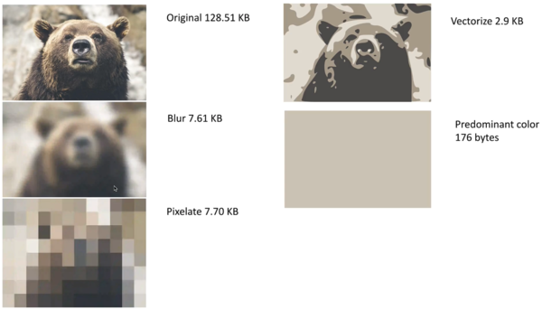
An image placeholder is a lightweight version of a target image that can be downloaded quickly, and will occupy the same location as the intended target image, while the target image is still downloading. Once the target image download has been completed the placeholder is replaced with the final image. This feature is especially useful together with large images.
Placeholder images offer the following features:
- The page loads quickly without blank locations.
- No page content 'jumping' as the elements dynamically adjust to add downloaded images.
To add a placeholder for a particular image, add the <Placeholder> component within the <Image> component. You can also add the type attribute to the <Placeholder> component to define the type of placeholder to use as follows:
Placeholder type
|
Transformation for the placeholder image |
|---|---|
blur (default) |
A low quality, blurred version of the target image. |
pixelate |
A low quality, pixelated version of the target image. |
vectorize |
A low quality, vectorized version of the target image. |
predominant |
A solid, single color image - the predominant color in the target image. |
For example, to use a pixelated placeholder image:
You can also combine placeholder images with the lazy loading feature. In this case, when the user scrolls to the image location, the placeholder image is downloaded followed by the target image.
For example, to use a vectorized placeholder image and the lazy loading feature:
Image accessibility
The image accessibility feature makes an image more accessible to users that may have a visual disability that impairs their ability to view images.
To enable the accessibility feature for a particular image, add the accessibility attribute to the <Image> component with one of the following modes:
| Mode | Transformation applied |
|---|---|
monochrome |
Reduces the image to only use one color. |
darkmode |
Adds a dark tinting effect to the image. |
brightmode |
Adds a bright tinting effect to the image. |
colorblind |
Adds an effect to differentiate between colors that are similar. |
For example, to assist color blind users:
Advanced image components video tutorial
Watch this video tutorial for an overview on Cloudinary's advanced image components described above: Lazy loading, Image placeholders and Image accessibility.
Tutorial contents
Applying common image transformations using React
This section provides an overview and examples of the following commonly used image transformation features, along with links to more detailed documentation on these features:
- Resizing and cropping
- Converting to another image format
- Applying image effects and filters
- Adding text and image overlays
- Image optimizations
- Responsive image settings
Keep in mind that this section is only intended to introduce you to the basics of using image transformations with React.
For comprehensive explanations of how to implement a wide variety of transformations, see Image transformations. For a full list of all supported image transformations and their usage, see the Transformation URL API Reference.
Resizing and cropping
There are a variety of different ways to resize and/or crop your images, and to control the area of the image that is preserved during a crop.
The following example uses the fill cropping method to generate and deliver an image that completely fills the requested 250x250 size while retaining the original aspect ratio. It uses face detection gravity to ensure that all the faces in the image are retained and centered when the image is cropped:
You can also use automatic gravity to determine what to keep in the crop automatically.
For details on all resizing and cropping options, see resizing and cropping images.
Converting to another image format
You can deliver any image uploaded to Cloudinary in essentially any image format. There are three main ways to convert and deliver in another format:
- Specify the image's public ID with the desired extension.
- Explicitly set the desired format using the
fetchFormatparameter. - Use the value
autoto instruct Cloudinary to deliver the image in the most optimized format for each browser that requests it.
For example:
- Deliver a .jpg file in .gif format:
- Let Cloudinary select the optimal format for each browser. For example, in Chrome, this image may deliver in .avif or .webp format (depending on your product environment setup):
The above code generates a URL with the
f_autoparameter:
For more details, see:
- Delivering images in different formats
- Automatic format selection (f_auto)
- Tips and considerations for using f_auto
Applying image effects and filters
You can select from a large selection of image effects, enhancements, and filters to apply to your images. The available effects include a variety of color balance and level effects, tinting, blurring, pixelating, sharpening, automatic improvement effects, artistic filters, image and text overlays, distortion and shape changing effects, outlines, backgrounds, shadows, and more.
For example, the code below applies a cartoonify effect, rounding corners effect, and background color effect (and then scales the image down to a height of 300 pixels).

For more details on the available image effects and filters, see Visual image effects and enhancements.
Adding text and image overlays
You can add images and text as overlays on your main image. You can apply the same types of transformations on your overlay images as you can with any image and you can use gravity settings or x and y coordinates to control the location of the overlays. You can also apply a variety of transformations on text, such as color, font, size, rotation, and more.
For example, the code below overlays a couple's photo on a mug image. The overlay photo is cropped using face detection with adjusted color saturation and a vignette effect applied. The word love is added in a pink, fancy font and rotated to fit the design. A balloon graphic is also added. Additionally, the final image is cropped and the corners are rounded.

Image optimizations
By default, Cloudinary automatically performs certain optimizations on all transformed images. There are also a number of additional features that enable you to further optimize the images you use in your React application. These include optimizations to image quality, format, and size, among others.
For example, you can use the auto value for the fetch_format and quality attributes to automatically deliver the image in the format and quality that minimize file size while meeting the required quality level. Below, these two parameters are applied, resulting in a 351 KB AVIF file (in Chrome) instead of a 1.4 MB JPG with no visible change in quality.

For an in-depth review of the many ways you can optimize your images, see Image optimization.
Responsive image settings
Responsive web design is a method of designing websites to provide an optimal viewing experience to users, irrespective of the device, viewport size, orientation, or resolution used to view it. Ensuring that optimal experience means you should avoid sending high resolution images that get resized client-side, with significant bandwidth waste for users of small displays. Instead, you should always deliver the right size image for each device and screen size.
Cloudinary can help reduce the complexity with dynamic image transformations. You can simply build image URLs with any image width or height based on the specific device resolution and viewport size. This means you don't have to pre-create the images, with dynamic resizing taking place on the fly as needed.
For example, you can ensure that each user receives images at the size and device pixel ratio (dpr) that fit their device using the auto value for the dpr and width attributes. The auto value is replaced with actual values on the client side based on the screen properties and viewport width:
Besides for a JavaScript based solution, Cloudinary also provides automatic solutions based on the Client-Hints standard. For more information on responsive images and Cloudinary's automatic responsive image solutions, see the detailed documentation on Responsive images.
 Programmable Media
 Digital Asset Management


